


1
2
3
4


If I were creating this webpage today, it would look very different: more and larger images and less copy. As well, I’d likely link off to some of the detailed information (such as pricing) rather than show it all on one page.
(A year or two after this, the web team was able to modernize the look and feel of the website by combining their programming skills with the Drupal content management system.) Here’s an example of what our microsites later became. I also worked on this exhibition, writing the copy for this page, providing images and liaising with the exhibition owners.
This screen cap was taken while I was working on the page.
Here also, if I could do this again today, I’d use more images and less copy.
As is often the case, every department wants to get their message out whenever they see an opportunity. It’s understandable, but the downside is that your main message loses prominence and audiences get distracted. In my opinion, the membership message is too much for this page. If I could have done so, I would have replaced it with a tile showing a happy Member family, and a link.
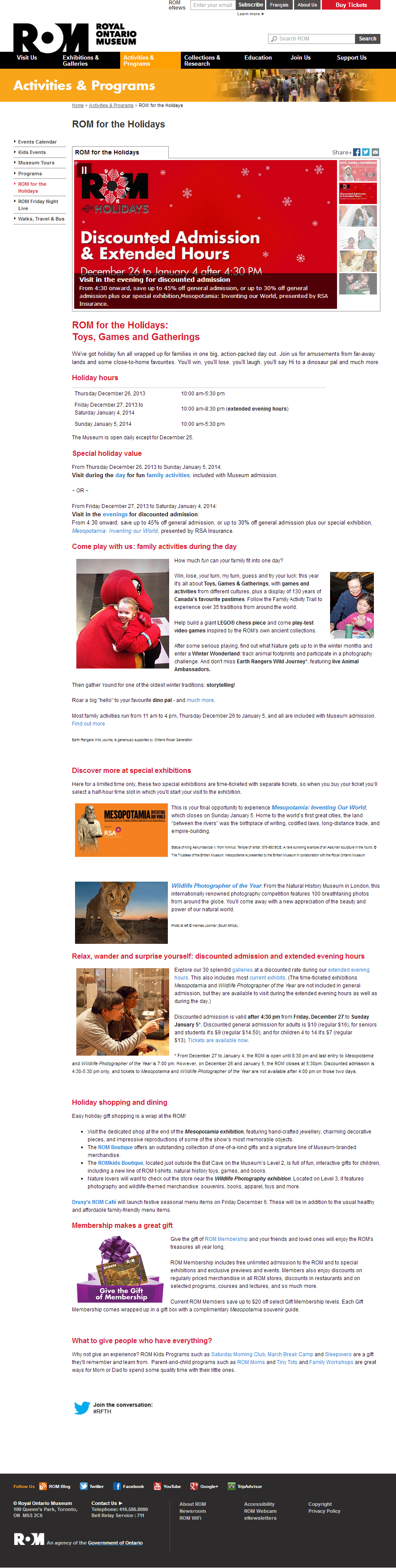
This screen cap was taken while I was working on the page.
If I were creating this webpage today, it would look very different: more and larger images and less copy. As well, I’d consider linking off to some of the detailed information, rather than showing everything on one page.
(A year or two after this, the web team was able to modernize the look and feel of the website by combining their programming skills with the Drupal content management system.) Here’s an example from the archives of what our microsites later became. I also worked on this exhibition, writing the copy for this page, providing images and liaising with the exhibition owners.
This screen cap was taken while I was working on the page. Click on image and zoom in to view the whole page.
Here also, if I could do this again today, I’d use more images and less copy.
As is often the case, every department wants to get their message out. It’s understandable, but your main message loses prominence and audiences get distracted. In my opinion, the membership message (further down on the page) is too much here. If I could have done so, I would have replaced it with a tile showing a happy Member family, and a link.
This screen cap was taken while I was working on the page. Click on image to view the whole page.