Creative Direction
During my career I’ve worked on print, broadcast, out-of-home and digital advertising, as well as had some fun with special executions and an augmented reality campaign. I’ve had the good fortune to work with five clever agencies, as well as some very talented freelancers. They designed the creative below; my role ranged from creative direction to trafficking to production coordination to guiding cross-functional teams on asset usage.
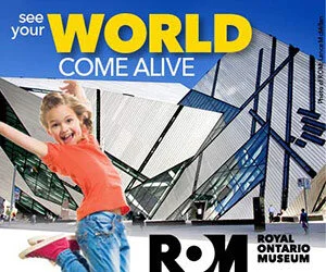
Campaign image for the Royal Ontario Museum (ROM), 2016. Used in print and online executions, and building banners.
Getting the look and feel just right
For this creative, I went through many versions with the agency to express the right feeling. I wanted to contrast the sensation of being outside in a wintry early evening—just that time of day when you start to feel chilly—with the welcoming warmth of the Museum, which glows as if lit by candlelight.
Torontonians have mixed feelings about the latest renovation to the ROM, called the Crystal. This ad was also one way of softening its jagged edges, of saying, “it may look a little hard and cold from the outside, but a warm welcome awaits you inside.”
A twilight scene was also appropriate because the Museum extended its opening hours into the evening during the holiday period.
Homepage Takeovers
For a homepage takeover to stand out, all elements on the page should have the same background colour. And the brighter, the better!
I designed and created these elements myself, based on the existing campaign look and feel and assets.
(HPTOs used to be more fun, as you could buy more real estate on the page. Recently I’ve noticed on a number of sites that the advertiser’s presence is limited to fewer items.)
Takeover of the Toronto Life homepage, 2013
Takeover of the BlogTO homepage, 2016
Special Executions
It’s so much fun to see something that you’ve worked hard to bring about take on a life of its own in the city!
Streetcar advertising the Royal Ontario Museum’s CHIHULY exhibition in Toronto.
A striking signature image such as this one is a natural for the glossy pages of magazines: the colours are so much more vivid than in newsprint.
That said, I bought newspaper for this campaign as well, in part because it takes a long time to build awareness with magazines. As well, given the short lifespan of newspapers, we could tweak the creative and include countdowns toward important dates. I’d often do this with a snipe (e.g. “Final week!”)
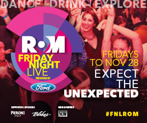
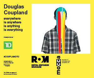
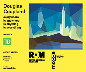
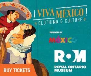
Digital Display Ads
For many of these, the agency developed the basic creative assets, and then I’d adapt them for use in basic digital ads, or I’d supervise an in-house designer who created the ads. If budgets are limited, this can help dollars go further.